Tuesday, September 7, 2010

Industry Workshop - Particles

This semester we have been working with Gordon Moyes in Industry Workshop. We are currently working a game with Mechs. Henrik and I have been tasked with making the sweet particle effects for the game.

This is the missile particle effect -


This is an effect I made for when a laser beam hits something metal -


You can download the packages and actually play the effects if you like -

Rocket
Metal spark

Sunday, September 5, 2010

Personal work - This weekend

There was a development weekend at my house recently.

I don't want to give anything away too soon, but I will share this -


Saturday, September 4, 2010

Kebablhu progress

The last couple of weeks I've been working on putting the game together in Adventure game studio (AGS). After going through the 'Starting off' tutorial, which was amazingly straight forward and helpful. I've set up all the rooms and you can walk around the entire Kebablhu universe. All the backgrounds and objects are place holders at the moment though, so it doesn't look like much yet. I've started setting up all the hotspots for the first room so I can put in some of Nic's hilarious dialogue. And the more I put in, the more excited I get about how awesome this game could be.

Here is just a quick example of how hot spots work.

This is the first room with nothing selected


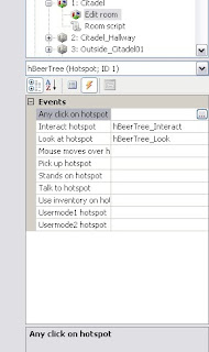
This is what it looks like with the hot spots menu selected, there is a drop down box on the right that lets you select which hotspot you want to paint. I have the beer tree selected.


This is the events tab on the right side. When you click on the 3 dots in the right column (it appears when you click on a cell). It takes you to the script for the room.

This is the script and you can see what happens when you look at or interact with the beer tree.


This is what it looks like in game.


It's amazingly simple to do, so I can definitely see us having something fun to play with in the next couple of weeks.

Sunday, August 22, 2010

Semester Two

Firstly, congrats to Henrik and Delia for winning 'Best Design in a Game' at Freeplay this year, with their game 'Up down Ready'. It was an amazing achievement for what seemed like a cool little indie game they made for uni. I think it was especially cool because I saw it grow from an idea to an award winning game in a matter of months :)

I haven't made a new post in quite a while. I've been meaning to, I was just a little disappointed with how Islands went last semester, so I've been putting it off. We didn't get everything we wanted done and the game kinda failed a bit. But that's okay, I've learned a lot from the experience, so this semester will be different.

There were a few ideas thrown around in the first couple of weeks, we changed our minds a couple of times and these are currently the games being worked on -
  • Run and Gun (2.5D Side scroller)
  • Phoenix (2.5D Side scroller)
  • Call of Kebablu (Adventure game)
I am currently working on Call of Kebablu. Which is a point and click Adventure game centered around a guy who has woken up from a long night of drinking and really wants a kebab. The script was already written, some of the other games students came up with it last year for another subject.

We are using Adventure Game Studio to create the game, which is perfect for this game... and it's free! I'm drawing up some storyboard images to be put in as placeholders, until the proper images have been done.

Here's one of the foodcourt -
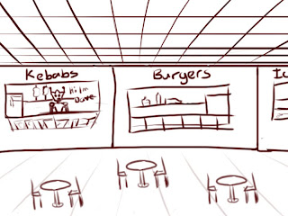

I'm not sure if these storyboard images will be laid out the same way as the final ones, but these are fine for now.

Sunday, June 6, 2010

Islands - Skybox

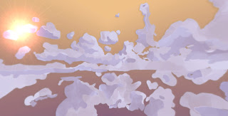
Last week I created a new sky box for our scene, so that it suits the style of the game a bit more.

Here's an in game screenshot without the islands -


I'm not sure how noticable it is, but the edge of each image is in pretty much in the centre of that picture. I'm really happy with how seamless it looks, and the colours work really well too, in my opinion.

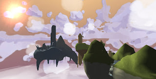
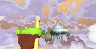
Here's some more shots with the islands and some place holder foreground clouds -


I really enjoyed drawing it, and it seems to have completely changed the look of the game (for the better). Things are looking promising for Islands once again! *fingers crossed*

Industry Workshop - Journal

For Industry workshop, I chose to try and add a Journal feature into the Skunkwerks game. Cameron and Henrik teamed up with me and we've spent the last few weeks throwing together some concepts, sending them to Andrew (the game creator) and seeing what he thinks of them. The final product isn't too far from what we started with, but it looks great! And Andrew seems very happy with it.

You press 'J' while in game and it appears like this -

Ignore the filler text >.>

We thought the current mission should be the first thing you see. Along with amount of objects you have collected and a list of missions you have completed.

Then if you click on Monsters, this appears -


In the pitch document, it explains that every monster type has a weakness you have to discover and use to defeat it. So we thought it would be a cool idea to have symbols representing these things on the left page, along with the list of the monsters on the right page.

When you click on a monster it looks like this -

We didn't have a description...

So you get a description of what the monster is, then the symbols underneath it so you know how to kill it and what stuff it drops when you do. We thought this might make the game too easy, so maybe you have to figure out how to kill it yourself before it appears in the journal. But that decision is up to Andrew. To go back to the monster list you just click on the blue monsters tab on the right. The symbols page doesn't change inside the tab, so you can refer back to it.

Weapons tab -

Again....no description

This has the same format as the monsters tab, I didn't think I needed an image of the weapons list. The symbols show what kind of damage the weapon does, to correspond with the weakness of the monsters. Again, the symbol page doesn't change inside this tab.

Lastly, the story tab -


All the words on the left are clickable, they have a similar format as the last 2 tabs. For example, if you clicked on Characters, a list of characters would appear on the right page. If you clicked on Dusty, then it would look like that image. We weren't sure what kind of stuff to have in this tab, that's also up to Andrew. But we do feel as if some things are necessary, like the character and story background. We think alot of players need that, to understand completely what's happening. That being said, it isn't being forced down player's throats and they don't have to read it if they don't want to.


Henrik is putting together a flash animation, so that everything that is clickable.....is clickable. That might make it a bit easier to understand. At the moment it can be a little difficult to explain.

Monday, May 24, 2010

Islands - UV's

Last week I UV'ed these objects for my Japanese island, Zac showed me how to do it in Blender and I found it much easier to do.


This week I will be figuring out the style and then texturing them.